Whitney Museum of American Art | America is Hard to See
May 24, 2015
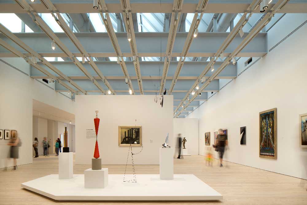
Eighth Floor Gallery Photograph © Nic Lehoux
WOW! I was looking forward to my visit to the newly re-opened Whitney Museum, but almost as soon as I entered I realized just what a treat it was going to be. The inaugural exhibit, America Is Hard to See, was hard to see — it was so good I didn’t want to rush it or be overwhelmed, so I decided my first visit would only concentrate on the top floor, covering the period from 1900 – 1940’s. I promised myself to come back soon to see the rest.
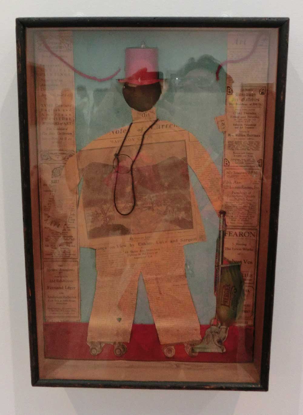
Arthur Dove The Critic, (1925)
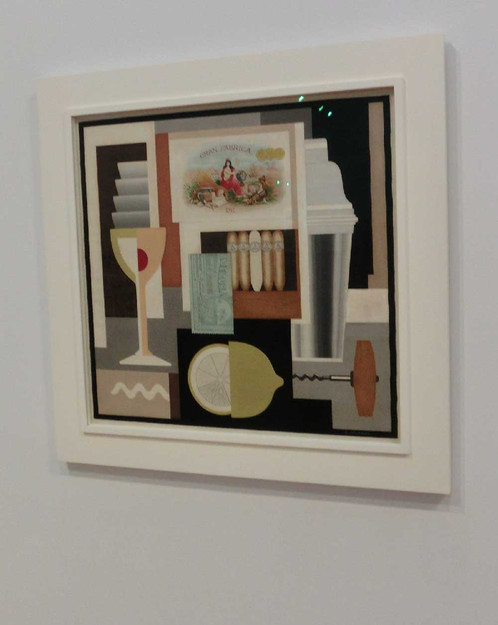
Gerald Murphy Cocktail, (1927)
The show is organized chronologically by floor, but within each floor the art is organized into “chapters” or themes, 23 in all. The first was “Forms Abstracted” showing how American artists, like their European counterparts, were flirting with abstraction while keeping figurative elements. Two gorgeous examples were Dove’s The Critic and Murphey’s Cocktail, both profoundly original takes on cubist collages.
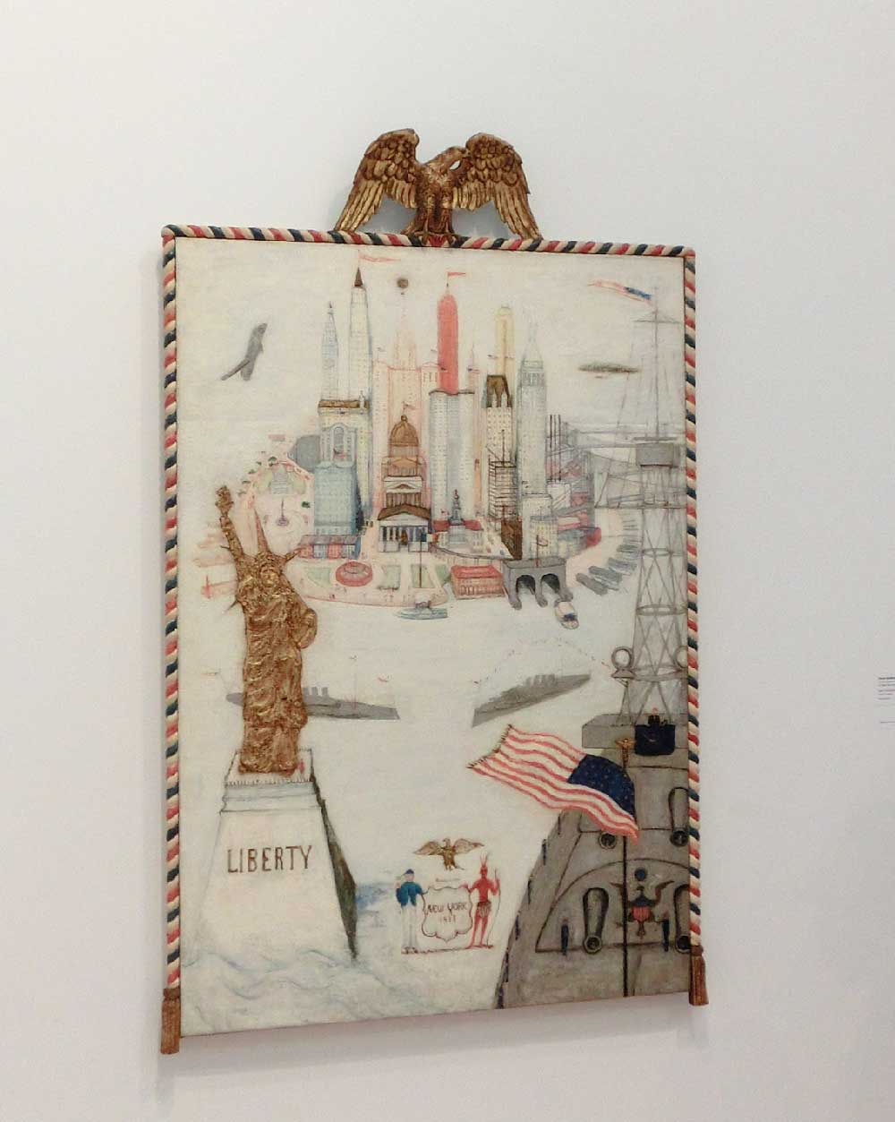
Florine Stettheimer New York – Liberty

Man Ray New York (1917)
Alexander Calder Little Ball with Counterweight (c. 1931); Hanging Spider (c. 1940)
Theodore Roszak Bi-Polar in Red (1940)
Another section was called “Music Pink and Blue”, highlighting artist’s interest in representing music visually. One painting New York – Liberty by Florine Stettheimer I found particularly striking. I loved the wonderful frame with the American eagle and the aerogram stripe. This piece also demonstrated another undercurrent of this exhibit, which was the inclusion of women and artists of color, who may not have been part of the tradition “cannon” of famous American artists, especially in the early 20th century. The size of the show allowed for the inclusion of many artists that were new to me — I couldn’t tell when this was simply because the show was large enough to incorporate more than the “greatest hits” I had studied in art history classes, or when the curators were making a point of being inclusive.
There were some beautiful juxtapositions which made me look at some classic pieces in a fresh way. In the chapter “Machine Ornament”, curators have installed a Man Ray casting of found objects with a couple Calders and Roszak’s Bi-Polar. These all are from different decades, but seeing them together both emphasizes the curator’s chosen theme as well as other common sensibilities from these varied artists. And in the same section, depictions of industry by Elise Driggs and Charles Demuth are hung with the abstract industrial forms of the sculptures. This chapter also combined fine art and commercial photographs by Edward Steichen and by Toyo Miyatake.

Elsie Driggs Pittsburgh (1927)
Website logo, as first loaded, and scrolled down
Tech Bonus
While there was no modern technology that struck me in these early 20th century galleries, one thing that the Whitney has done which has impressed me is the implementation of the museum’s new branding. The “w” in whitney is transformed into triangles that show up everywhere, even in the exit signs. On the website, the triangles of the logo were implemented using the HTML5 <canvas> tag, drawing the logo dynamically using code. The logo is the full “w” when the homepage loads, but as the user scrolls, the logo transforms and distorts, the top nav and and the w logo within it become much shallower, while keeping their same width. This is done by changing the angles in the w, even at it becomes almost unrecognizably abstract. For me, this is a great use of technology, to do something unexpected with a logo.
© 2026 50 MUSEUMS IN 70 WEEKS | Theme by Eleven Themes
Leave a Comment